
Reporting with MX8 Labs
With MX8, you start to get data as soon as you have respondents; in fact, you can see simulated respondents as soon you've set up the survey. Start by visiting the reports tab on the screen:
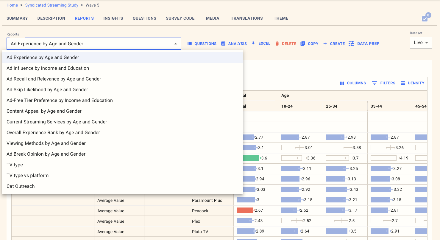
The main elements you'll see here are:
A drop-down containing the current reports. When you create a new survey, this will be populated by a set of AI-created reports, which will likely provide a good starting point for your inquiries.
A link to download the report in EXCEL format
A link to edit the QUESTIONS included in the report
A button to change ANALYSIS for the report
Buttons to COPY reports from another survey, CREATE a new report, and run DATA PREP to modify the data.
A dropdown to change the dataset. When you first create a survey, this will show the simulated data and switch to Live as soon as you have live data in the platform.
Editing report questions
To edit the questions in the report, click on the button, and you can change the name of the report and the questions you want to include.
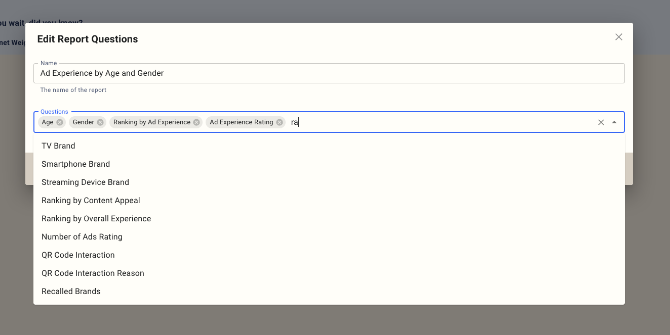
To choose questions, you can pick them from the drop-down or enter a few characters to search for them.
To remove questions from the report, click on the X next to them.
Analysis settings
The report button let you configure how each question is displayed. If there are additional tags associated with a question, then these will also appear in this list.
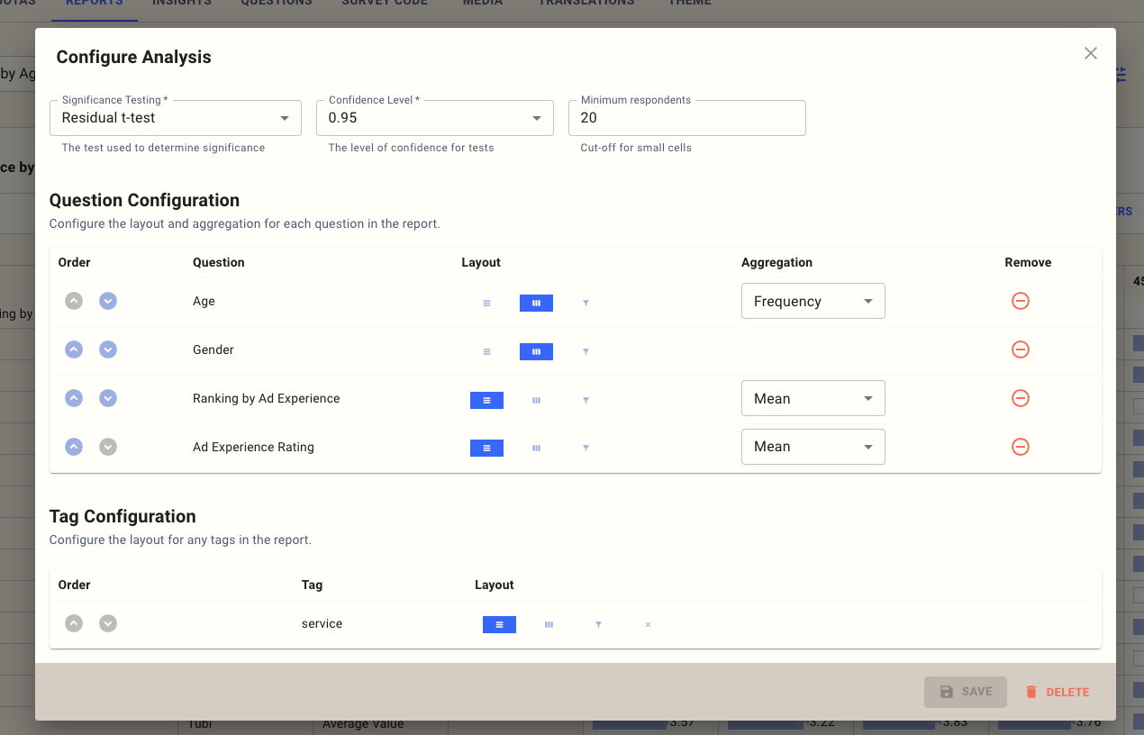
The primary configuration elements for the report are:
Significance testing - how the report is stat tested, we support three options:
A residual t-test - this highlights results that are statistically higher and lower than would usually be expected based on a linear distribution of values between rows and columns
A t-test on each row - that marks in each cell the labels of the rows that are statistically lower than this cell.
A t-test on each column - that marks in each cell the labels of the columns that are statistically lower than this column
Confidence level - typically 0.95, how confident the platform should be before highlighting a result as statistically significant.
Minimum respondents - typically 20, and defaults to the value set on the project screen; any cells in the report with fewer than this number of respondents are grayed out.
Also, for each item in the report, you can choose how it should be displayed:
Rows are the primary reporting element in the report
Columns are used to group and cross-tabulate elements in the report. Base sizes are always reported based on the column, so percentages are shown as a percentage of the column.
Filters provide an additional drop-down to filter the entire report by a variable.
Some questions also have additional reporting options. Numerical questions such as rating, ranking, or numeric questions can be reported as follows:
Frequency - this shows the frequency of each value; this is the default value to use if you have recodes specified in the survey.
Mean - calculates the mean value for the cell. This is most useful if you have complex data and want to compare, for example, average ranks across several items.
Top box - groups numbers together based on the top and bottom numeric values. For rating and numeric questions, the highest numbers go in the top box, but for ranking questions, the lowest number (e.g., the first ranked) goes in the top box.
Top 2 box - works the same as the top box but groups together the top and bottom two results.
You can also change the order of the questions in the data.
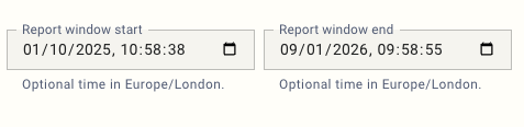
Filtering by time
For some studies, such as multi-wave trackers, you may want to filter the report to cover only a specific period. For this, you can adjust the report window in the analysis dialog:
Interpreting the data
The results are displayed in a standard cross-tabulation:
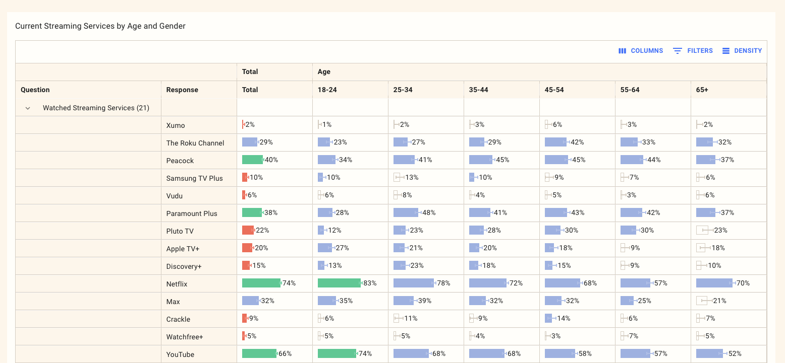
Keep in mind the following:
Results are always weighted to represent the quotas you have defined in your survey. This is typically Gen Pop unless you've set up custom quotas.
Percentages are always calculated as the percentage of the base size on the column.
Any cells starting n= represent the base size for that column where there is a range in the base size that indicates that different base sizes apply to each row.
Any bars highlighted in green are statistically significantly higher than other cells.
Any bars highlighted in red are statistically significantly lower than other cells.
The blue bars are neither statistically significantly higher nor lower, and should be considered the basline.
The white bars are those with fewer than the minimum respondents than those set in the analysis tab.
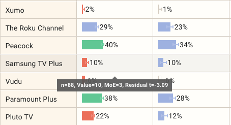
If you want to know more about the errors on each bar, there are two things to look at:
There is a smaller range bar in each cell that shows the range of values for that cell that fit within the statistical significance
When you move the mouse cursor over each cell, you will see a tooltip with more information:
n= shows the number of respondents within each cell
Value shows the value of the c.ell
MoE shows the margin of error on this result based on the specified confidence level.
The residual value, if a residual test is used.
Recoding and other data prep tasks
You can make extensive post-field updates to the survey data by hitting the data prep button. This functionality is documented in this article:
https://help.mx8.io/en/articles/11148291-recoding-and-post-field-data-wrangling